
albelli
illustration system development
Simple, not basic
The goal was to develop an illustration system to support brand communications, establishing clear guidelines for creating new illustrations, defining workflow, and standardizing visual details.
Objetives
Create a cohesive brand experience.
concept
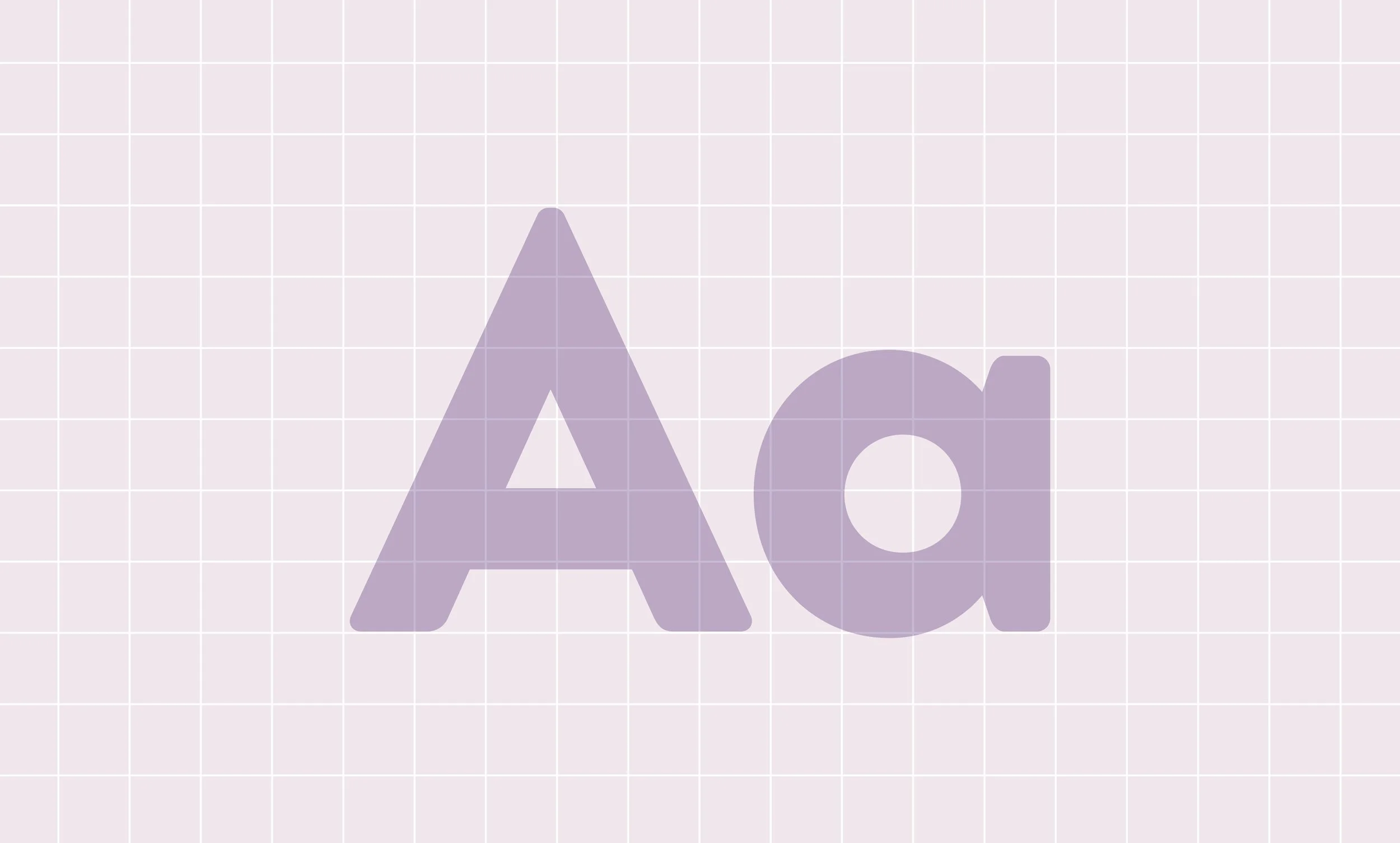
To define the illustration system, we drew inspiration from the brand’s typography, Brandon, a sans-serif typeface with a geometric foundation softened by optical corrections that give it a human, organic feel. Following this principle, the illustrations begin with simple geometric shapes and are elevated through a few unexpected details, increasing visual appeal without adding unnecessary information or distracting from the message.

Principles
The illustration style is guided by three core principles that ensure consistency and clarity across the system.
Frontal view: used to keep compositions direct, readable, and approachable.
Rounded corners: applied consistently, with curves based on one-quarter of the shape’s proportions, creating a soft, cohesive visual language.
Color usage: intentionally limited to a maximum of three colors per illustration, reinforcing simplicity, focus, and strong visual hierarchy.