kari kari
branding
a high quality fast food
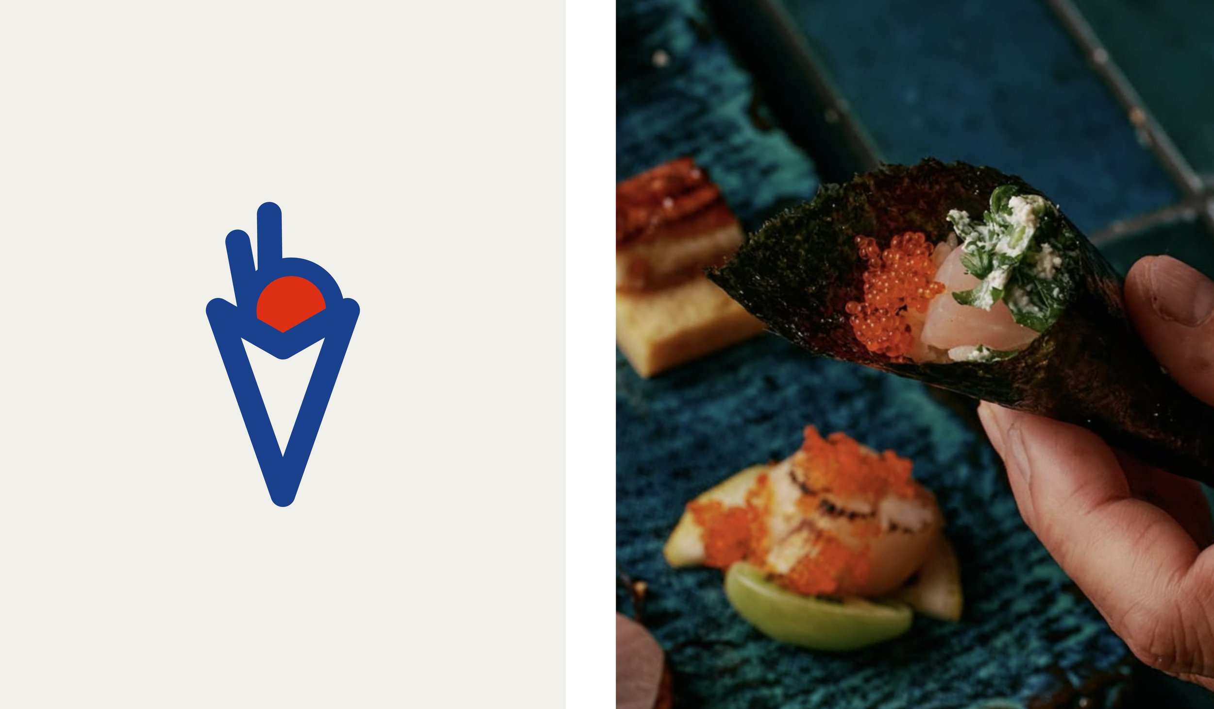
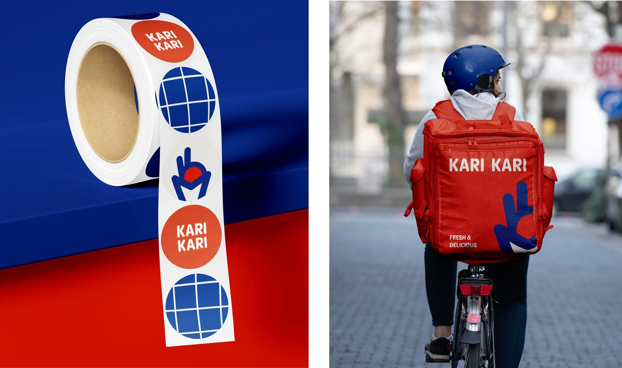
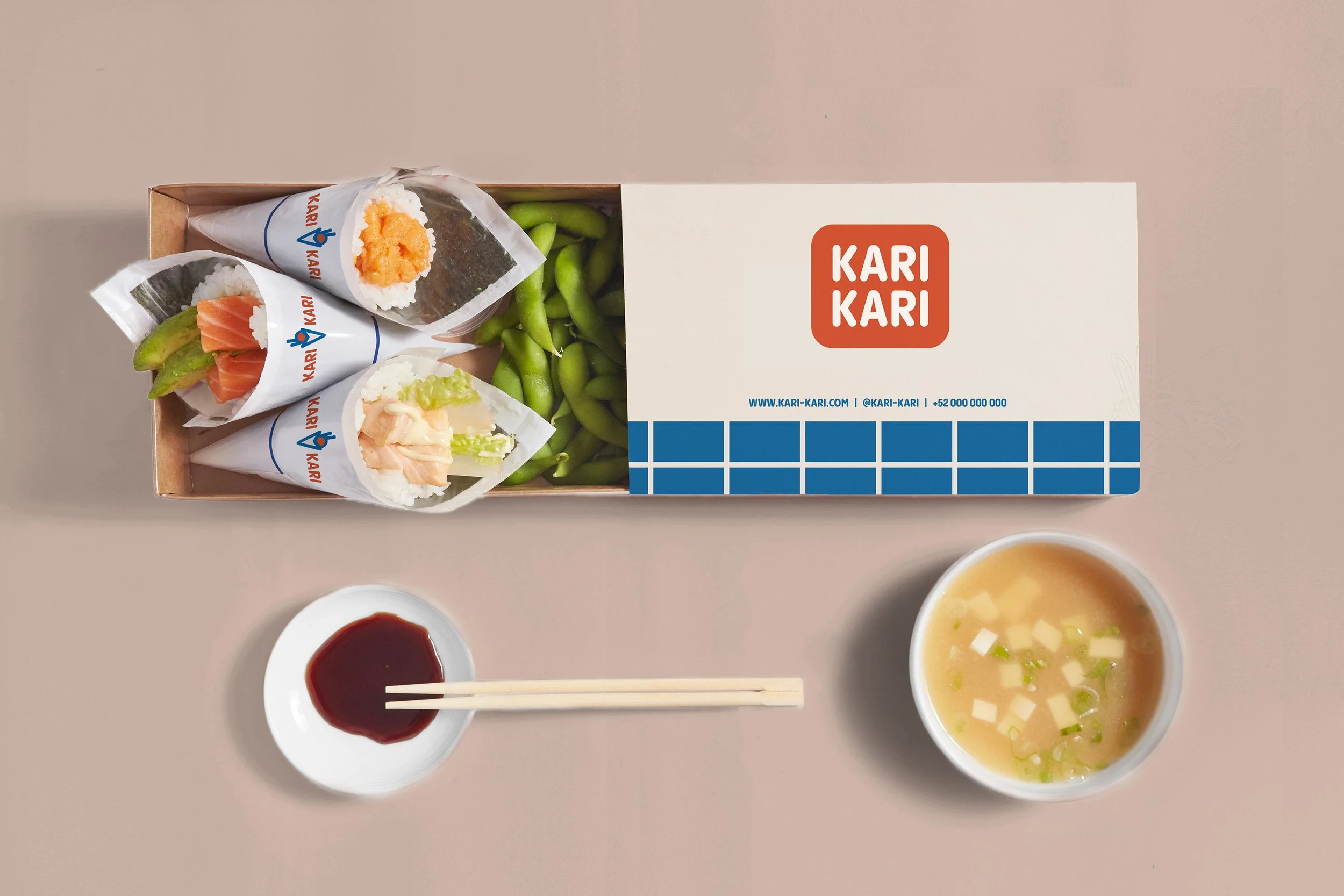
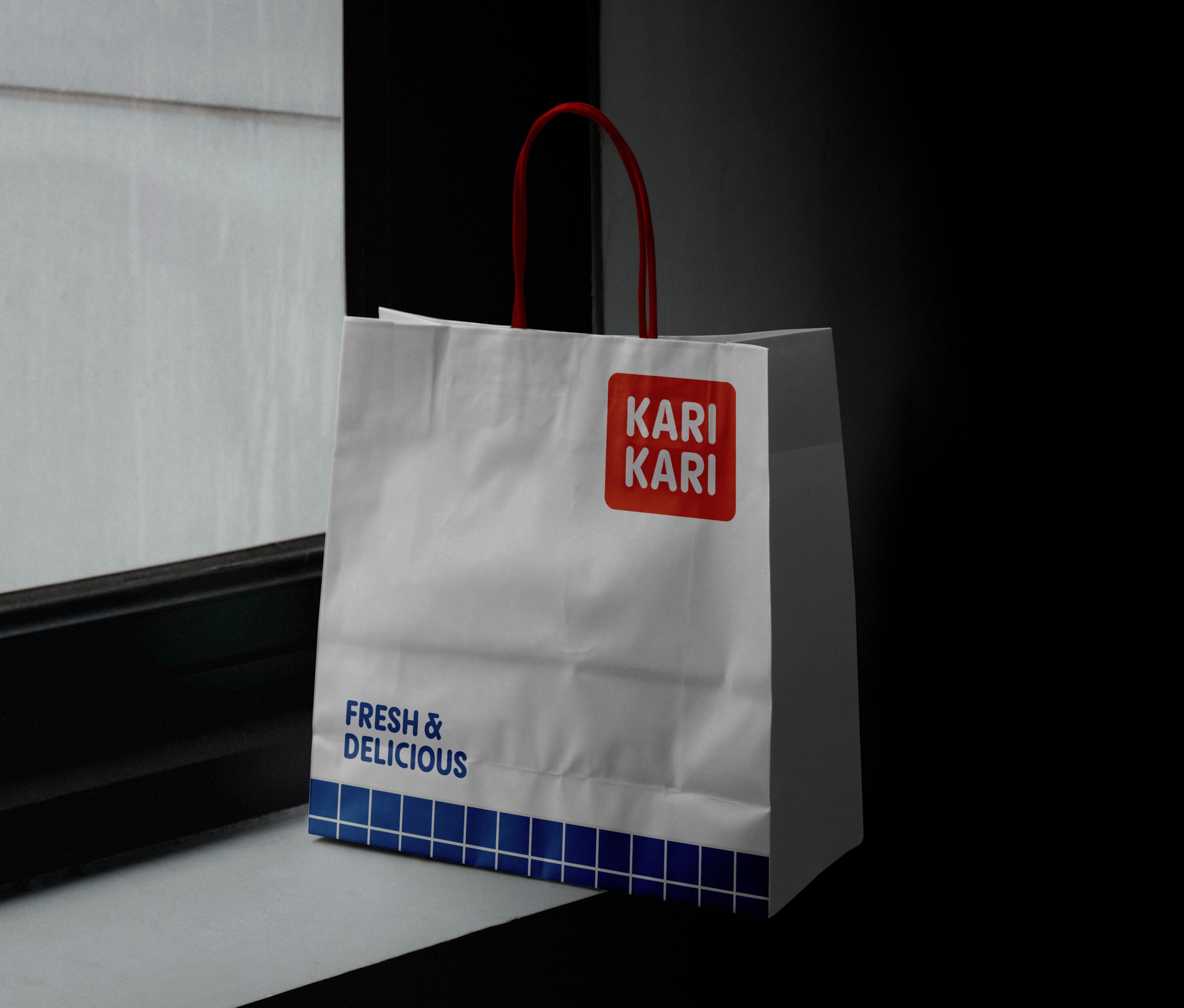
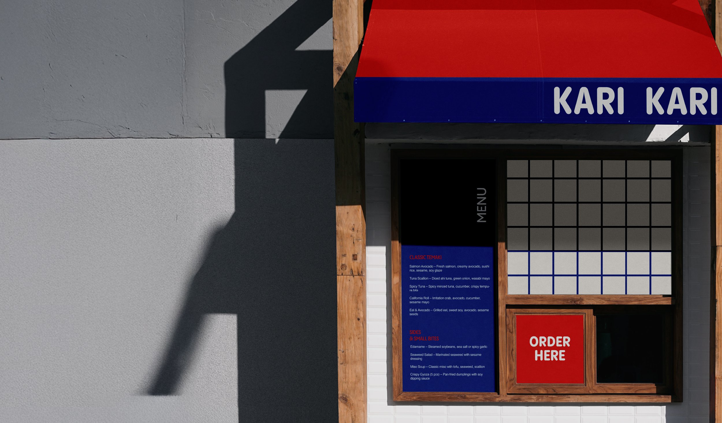
Based in Mexico City, this restaurant is not just about temakis, but about human warmth, shared meals, and the joy of eating together. They do temakis with Japanese quality and urban flair. A key requirement was to be easily recognizable and highly legible across busy visual environments such as menus, food courts, and delivery platforms.
Objectives:
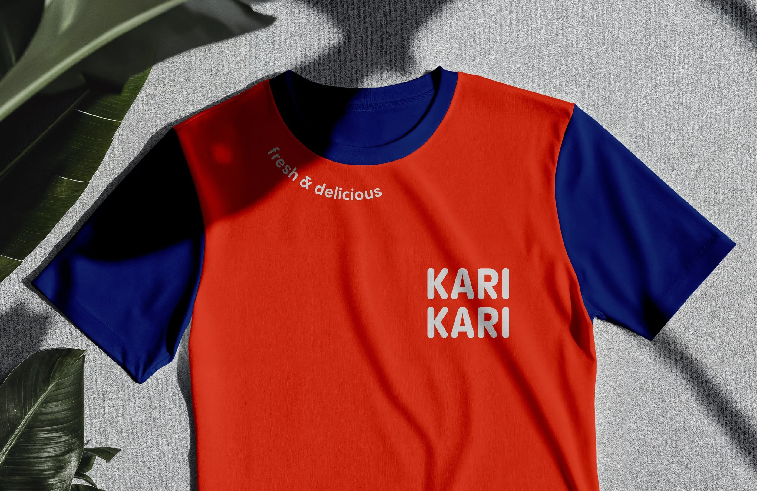
Create a brand that feels modern, approachable, and expressive.
concept
The typography uses a condensed, rounded sans-serif font that feels friendly, modern, and informal. This choice positions the brand as approachable and people-first rather than premium or rigid. It works in harmony with the icon, which reflects the brand’s traditional roots through a reference to the Japanese rising sun. This element acts as a visual accent, creating balance and contrast within the temaki symbol while reinforcing the connection to the concept’s Japanese origin and cultural essence. The color palette was selected to strike a balance between energy and expertise.