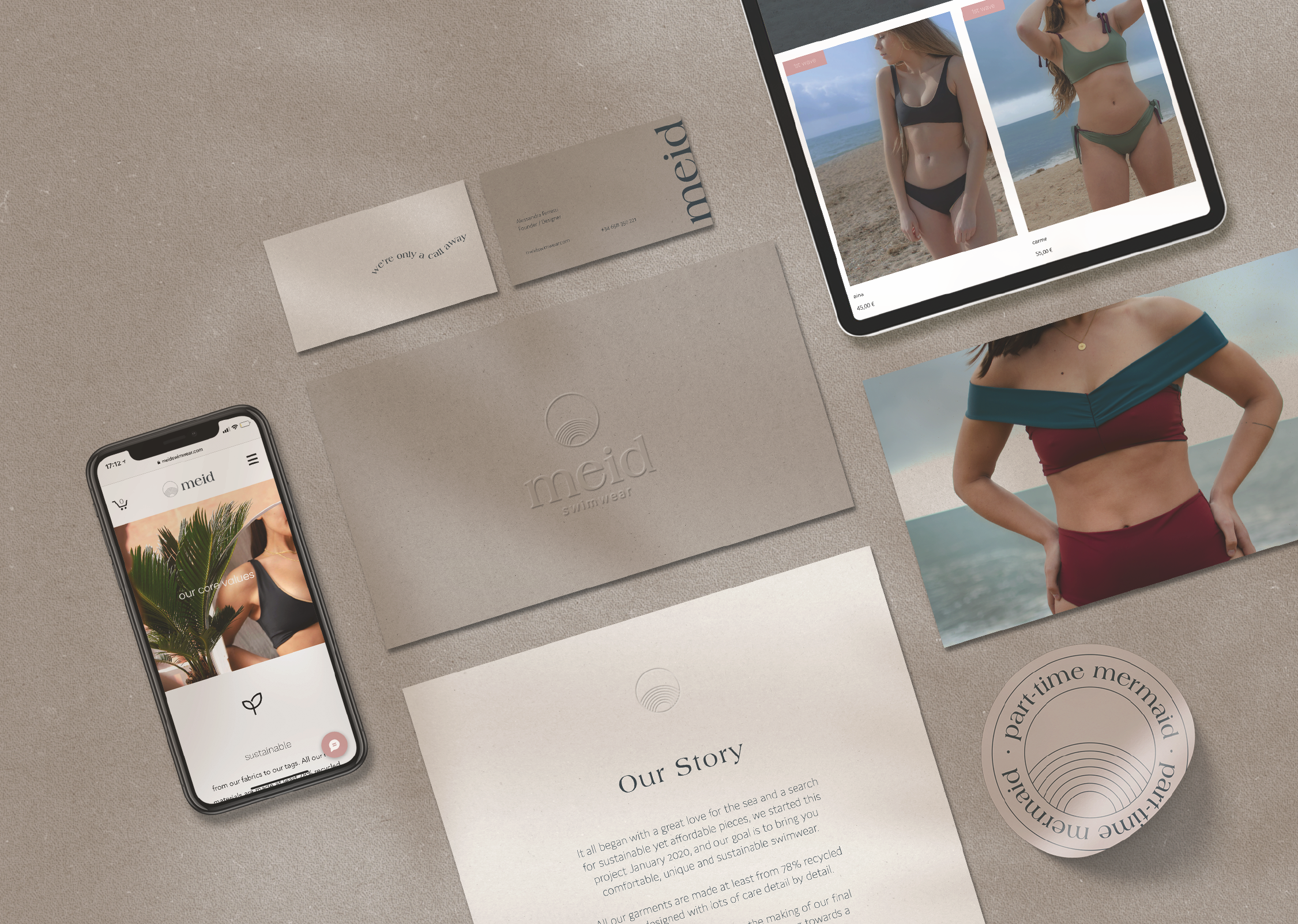
meid
naming, branding, photography direction & product design
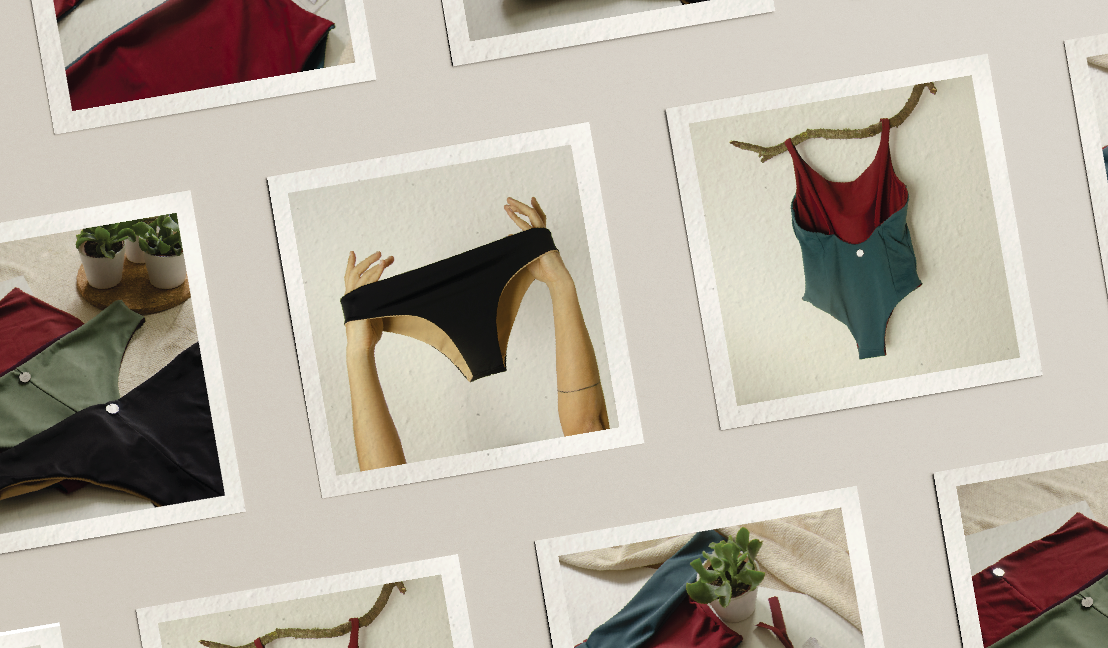
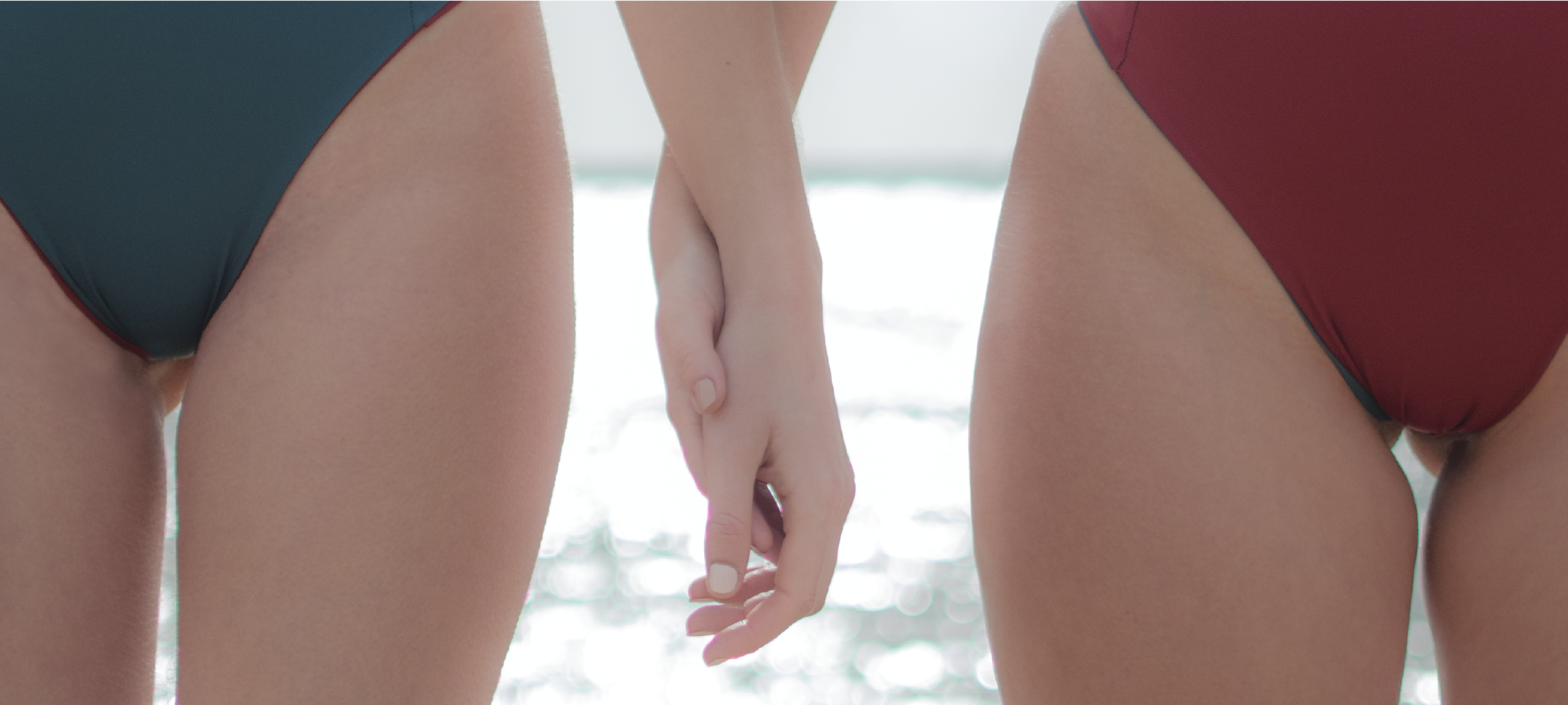
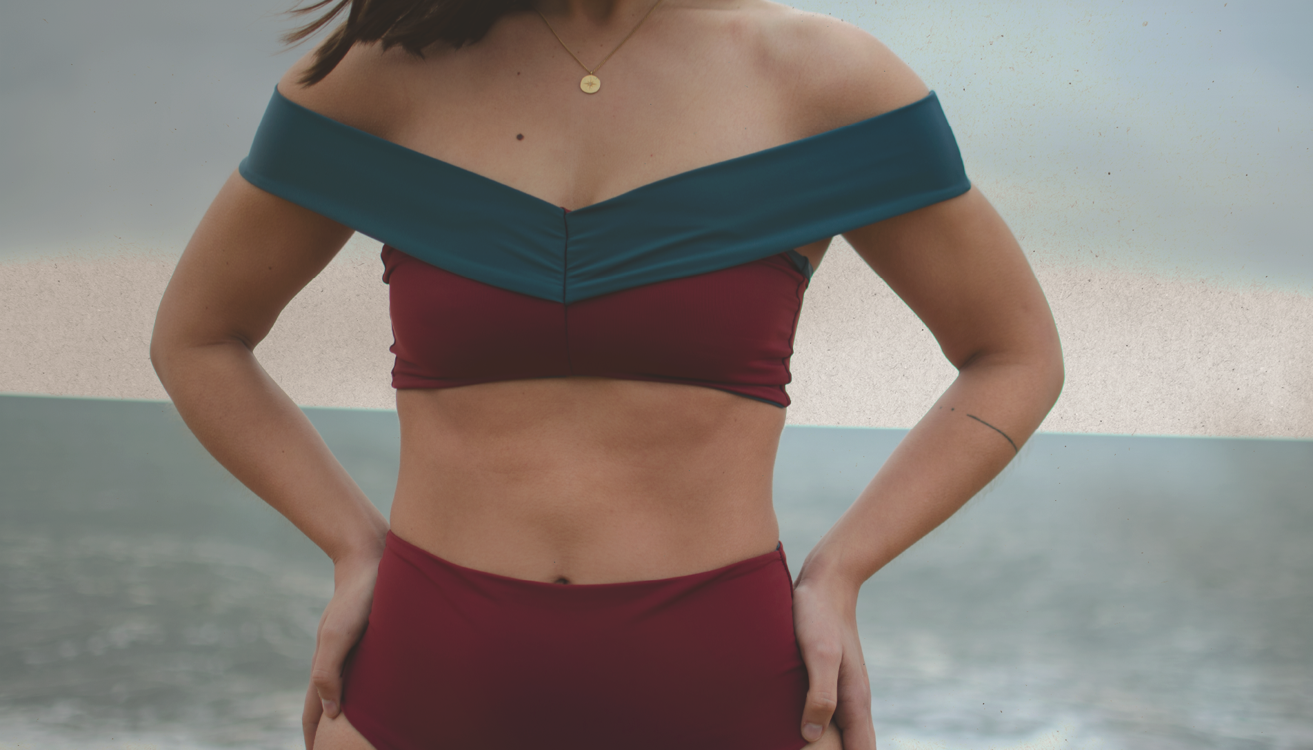
swimsuits designed & made with care.
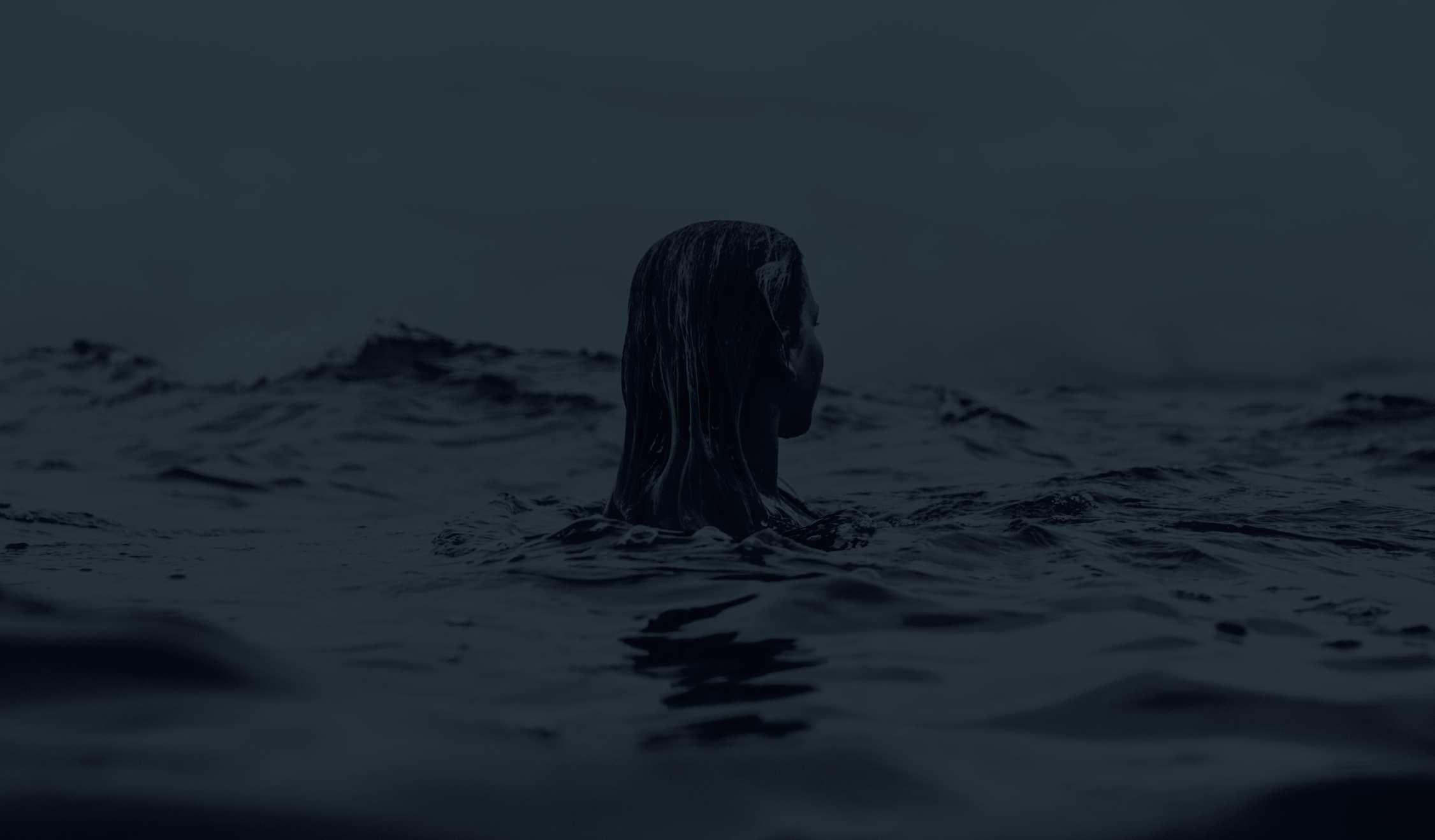
A personal project that began with great love for the sea and a search for sustainable yet affordable pieces, that could inspire confidence and comfort in women.
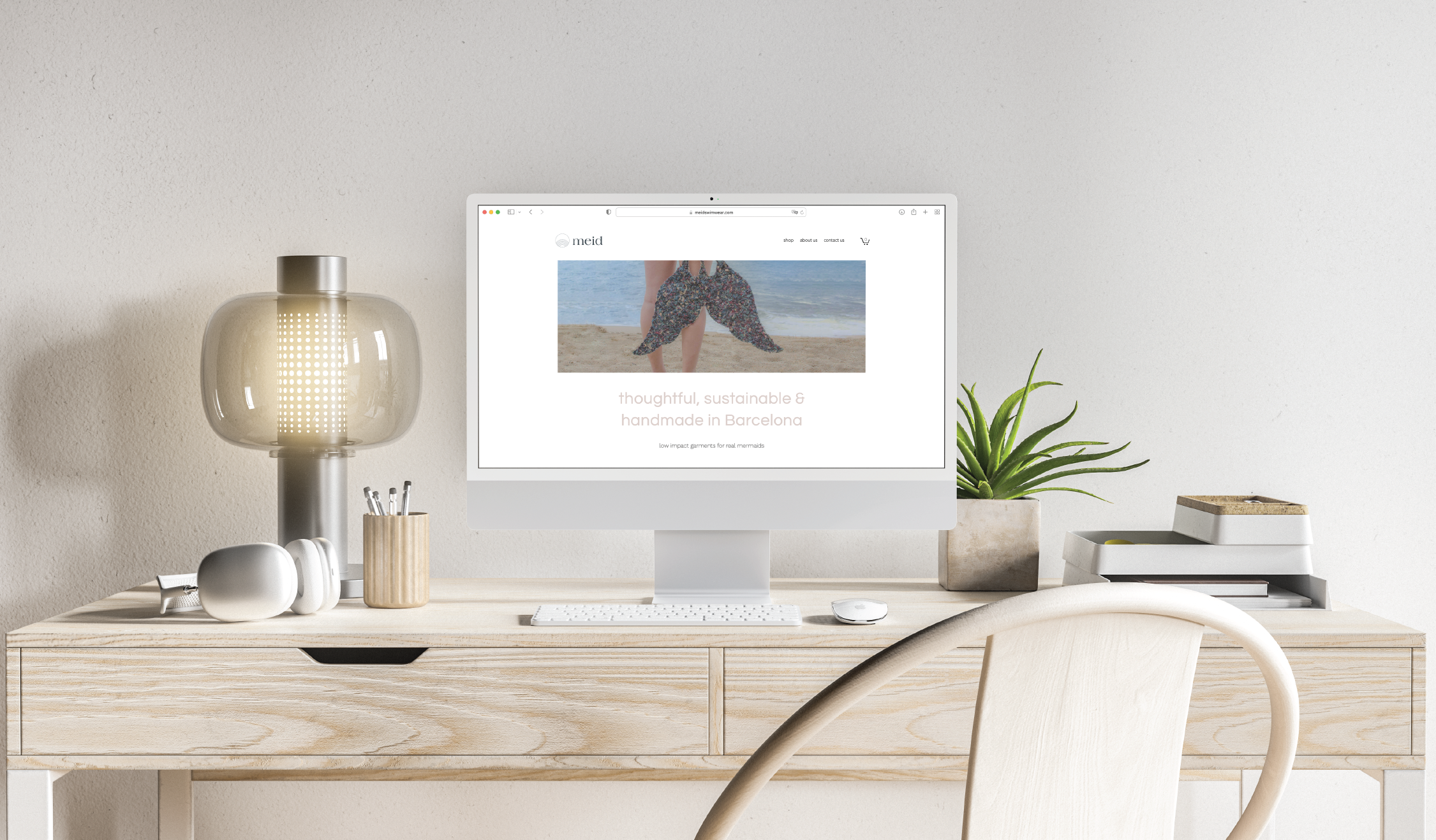
The swimwear market is dominated by highly stylised, trend-driven brands that often rely on bold graphics and saturated visuals. Meid was conceived as a contemporary swimwear label focused on simplicity, elegance and timeless design. The goal was to develop a brand identity that felt refined, modern and editorial, positioning the product closer to fashion than typical beachwear.
Objectives:
Create a brand not just for a product, but for a community, the branding had to be as flexible as the idea of the project was. Develop a narrative and visual style of each process.
Project developed with Rita Rosmaninho.

challenge
The identity needed to communicate a premium aesthetic while remaining approachable and translate seamlessly across fashion photography, packaging and digital platforms to create a visual language capable of evolving with seasonal collections
The brand needed to feel distinctive in a highly saturated fashion category.
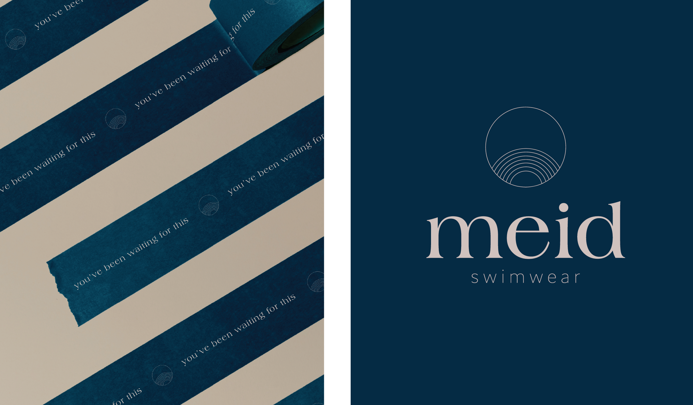
naming
The name Meid was selected for its short, memorable structure and contemporary sound.
Its simplicity reflects the brand’s minimalist philosophy while remaining distinctive within the fashion market.
The name also allows the visual identity to remain clean and typography-driven.
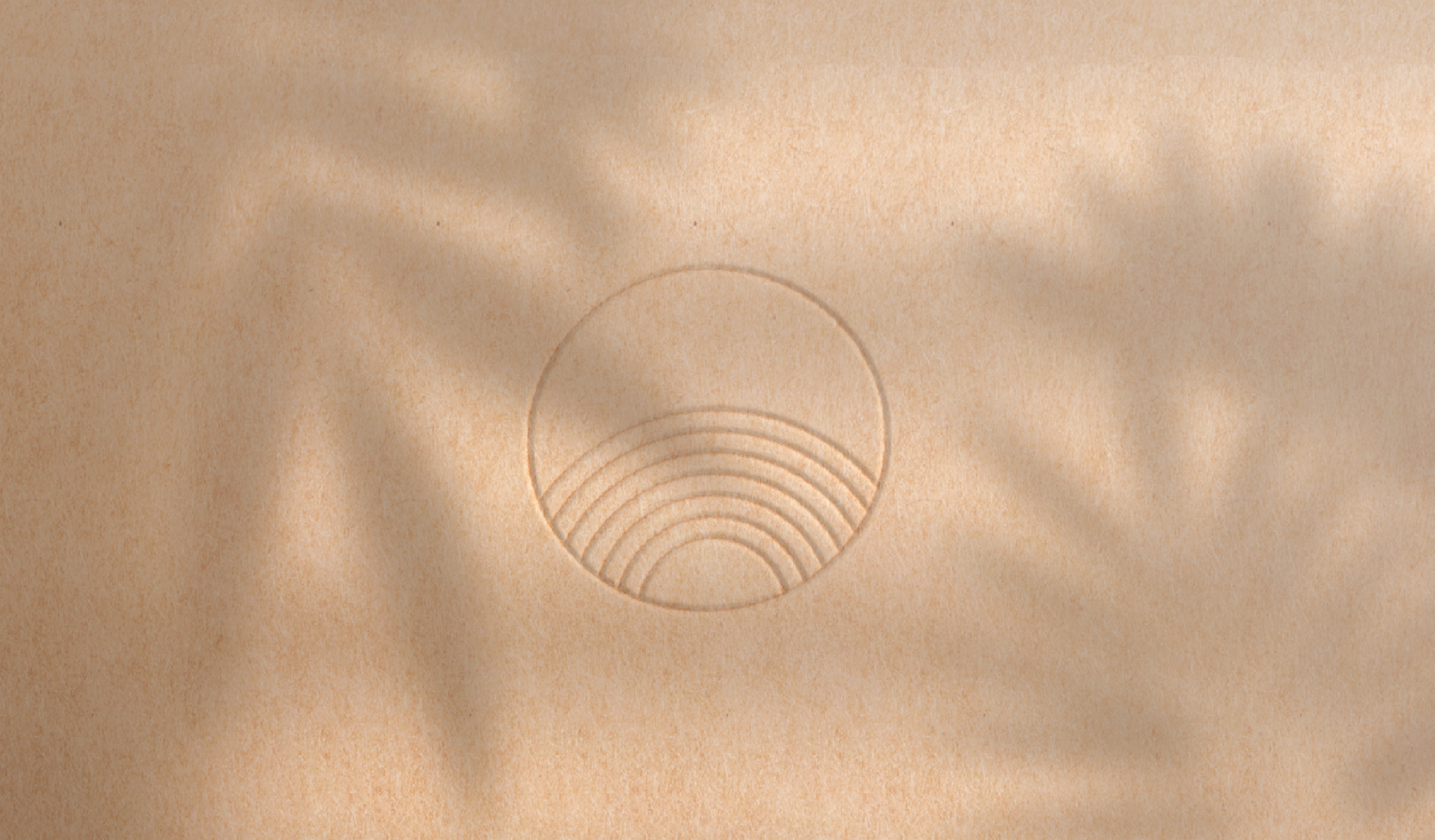
concept
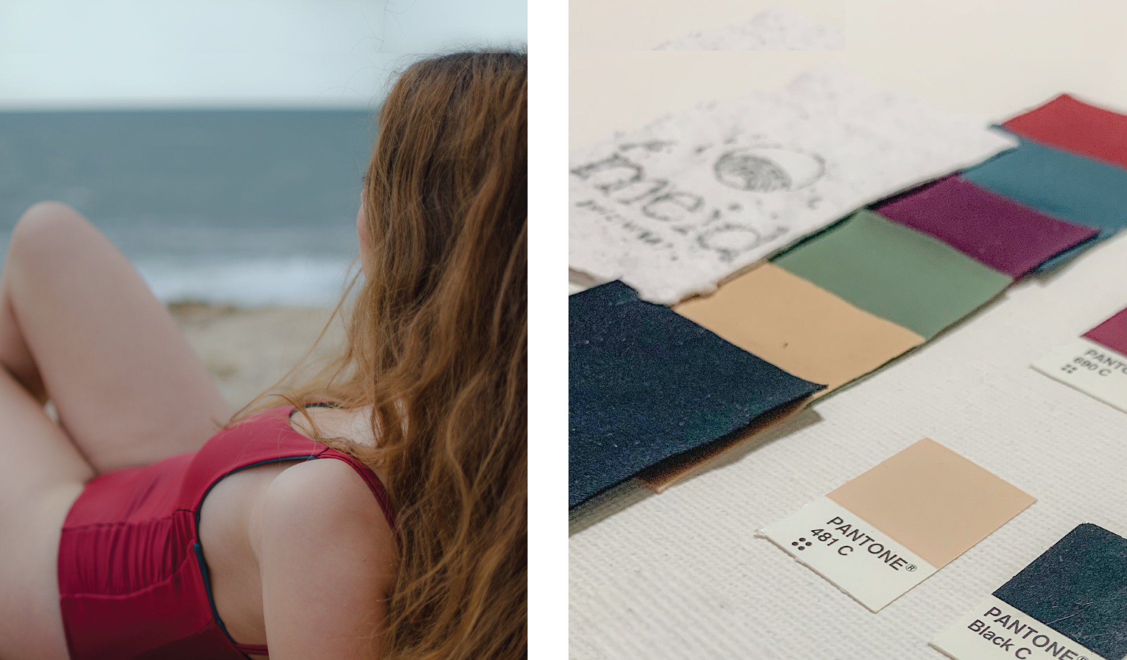
built around quiet confidence and understated elegance. The identity embraces subtlety and restraint, allowing the garments and photography to carry the emotional tone of the brand.
The visual system focuses on: refined typography, generous white space, neutral colour palettes and editorial-style imagery
This approach positions Meid closer to contemporary fashion labels than traditional swimwear brands.
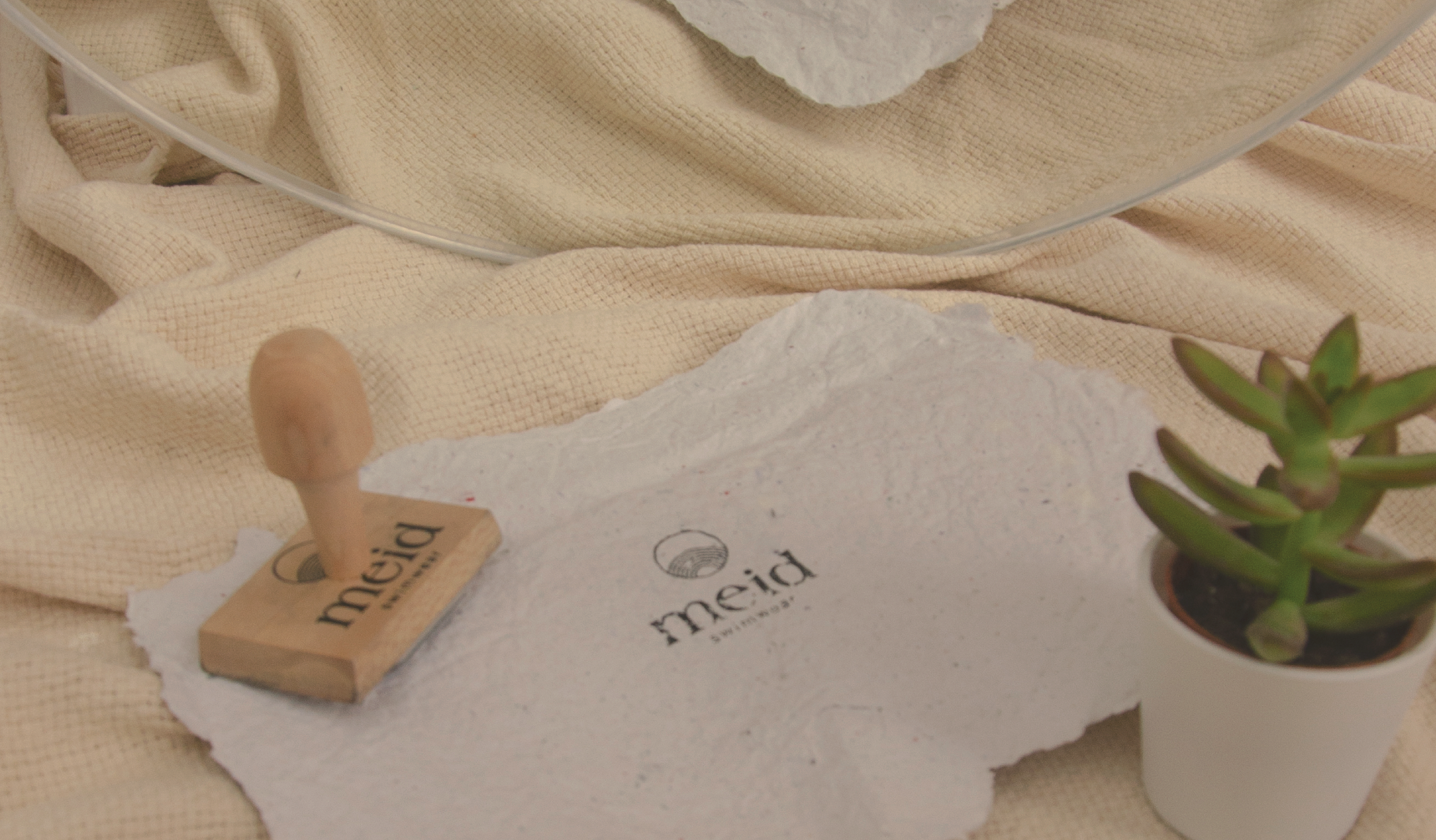
the process
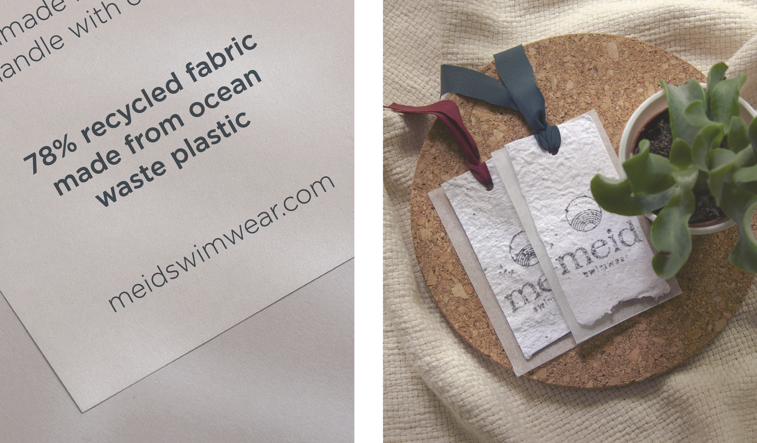
from the start one of the main goals was to figure out how we could reclaim waste and give it a new life, some of our main achievements are: the labels are made from home recycled paper obtaining the pulp and drying it to make beautiful textured new paper, the inks we used for dying the mailing bags came from avocado peels and ash, and finally we are using the scraps that we created in the cutting stage of the pieces to test a mix of bio-based plastics to create new fabric. We’re still experimenting with different ways to repurpose our waste and wish some of our findings can be applied in a greater scale.
outcome
The final identity establishes Meid as a modern swimwear brand with a refined and editorial aesthetic.
The flexible visual system allows the brand to evolve with future collections while maintaining a strong and recognisable identity.