soy
naming, brand strategy, identity design & low - impact packaging design
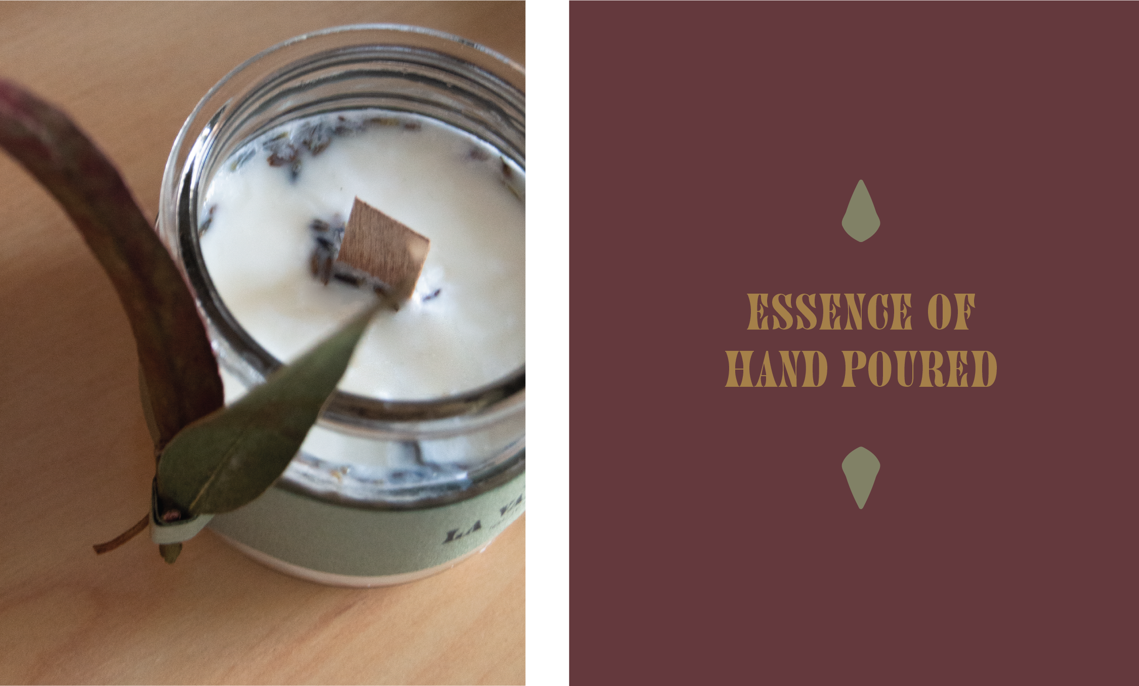
Hand-poured vegan scented candles.
A Sustainable Candle Brand & Refillable Packaging System. The home fragrance market is saturated with decorative candle brands, many of which rely on single-use packaging and synthetic ingredients. Soy was conceived as a minimal, environmentally conscious alternative, focusing on natural wax and a packaging system designed to minimise waste.
The challenge was to create a brand that feels warm, refined, and sustainable without falling into the typical “eco-aesthetic”.
Objectives:
Appeal to a conscious consumer. Communicate product quality and benefits. Design a product packaging with refilling/reusing capabilities.

challenge
The identity needed to stand out in a crowded lifestyle category while avoiding cliché eco-branding. Support a low-impact packaging solution that work across retail and e-commerce environments.
naming
in search for a word that praised the naturality of the product and also connected the spiritual factor of the brand we found “soy” as it places the main ingredient front and center while having the connotation of “being” in the Spanish translation, linking the tangible with the spiritual.
concept
The brand concept is built around the idea of purity and simplicity.
The name Soy references both the natural wax used in the candles and a sense of essential minimalism.
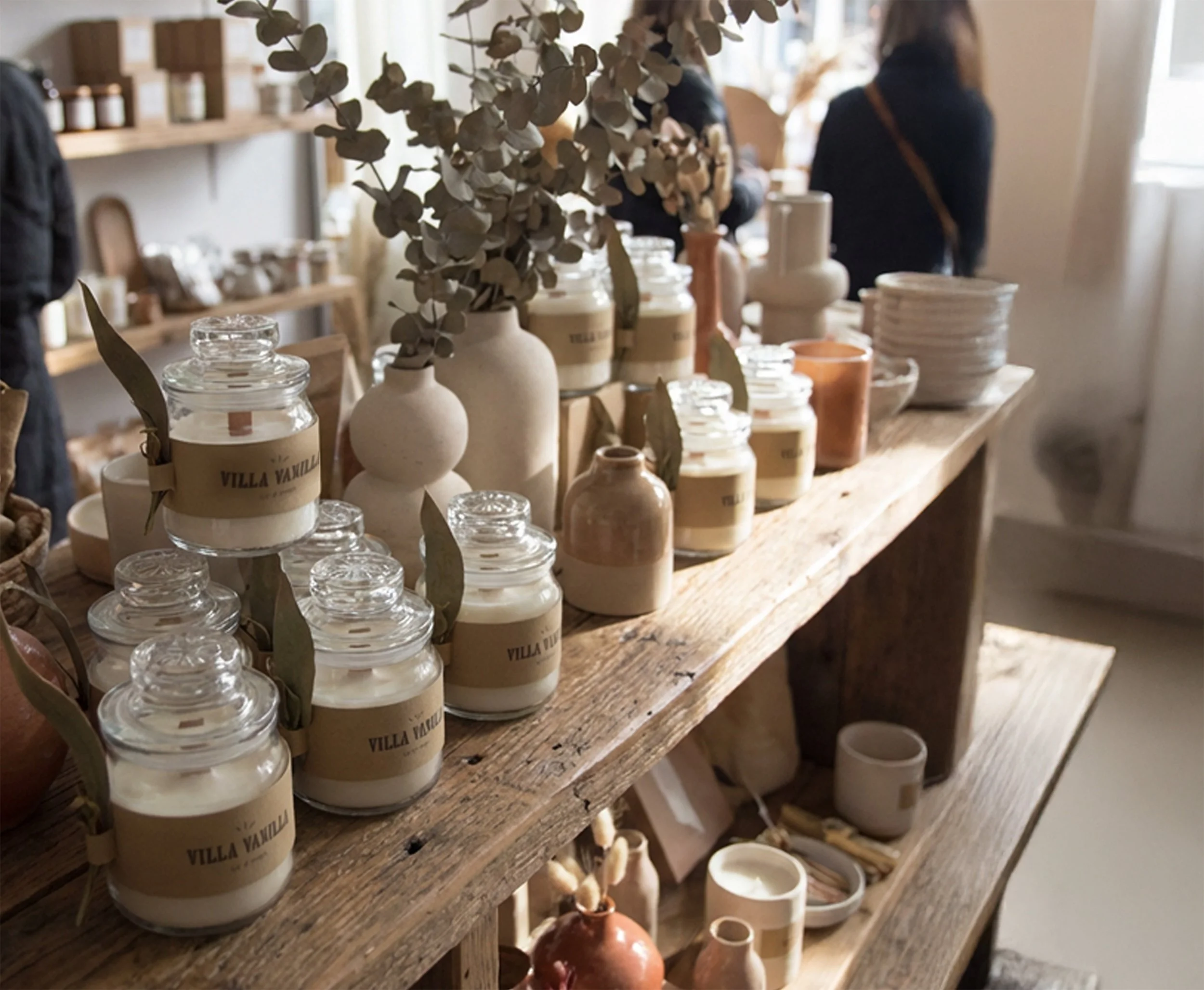
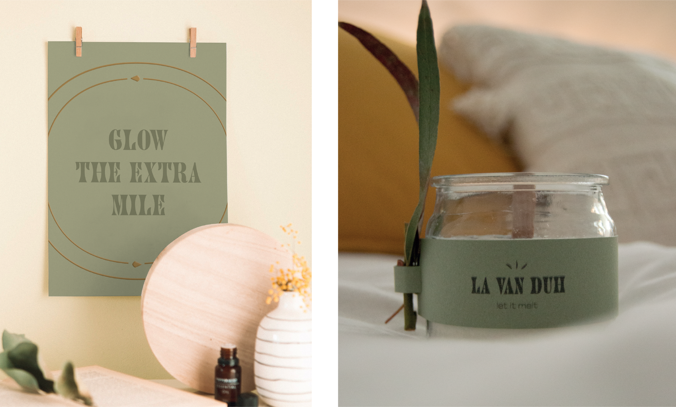
The visual language reflects this philosophy through an unrestrained typography, soft neutral tones and the use of tactile natural materials
The identity aims to evoke calm domestic rituals rather than decorative luxury.
packaging
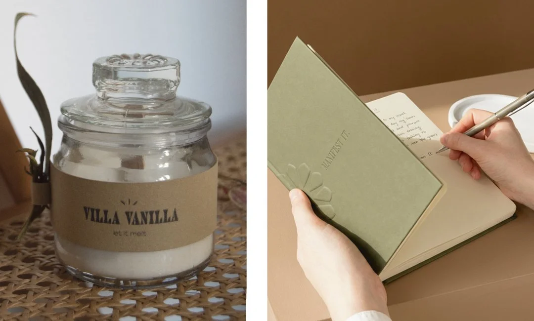
Packaging was designed with material efficiency and reuse in mind. The key considerations were: minimal ink usage, recyclable paper stocks, reusable glass containers.
The label system was intentionally restrained to reduce printing processes and emphasise material quality.
This approach allows the packaging to function both as product protection and a long-term object within the home.
outcome
The final identity creates a calm and refined brand presence that communicates sustainability without relying on typical eco-visual clichés.
The system is flexible enough to support future product extensions while maintaining a consistent visual language.


