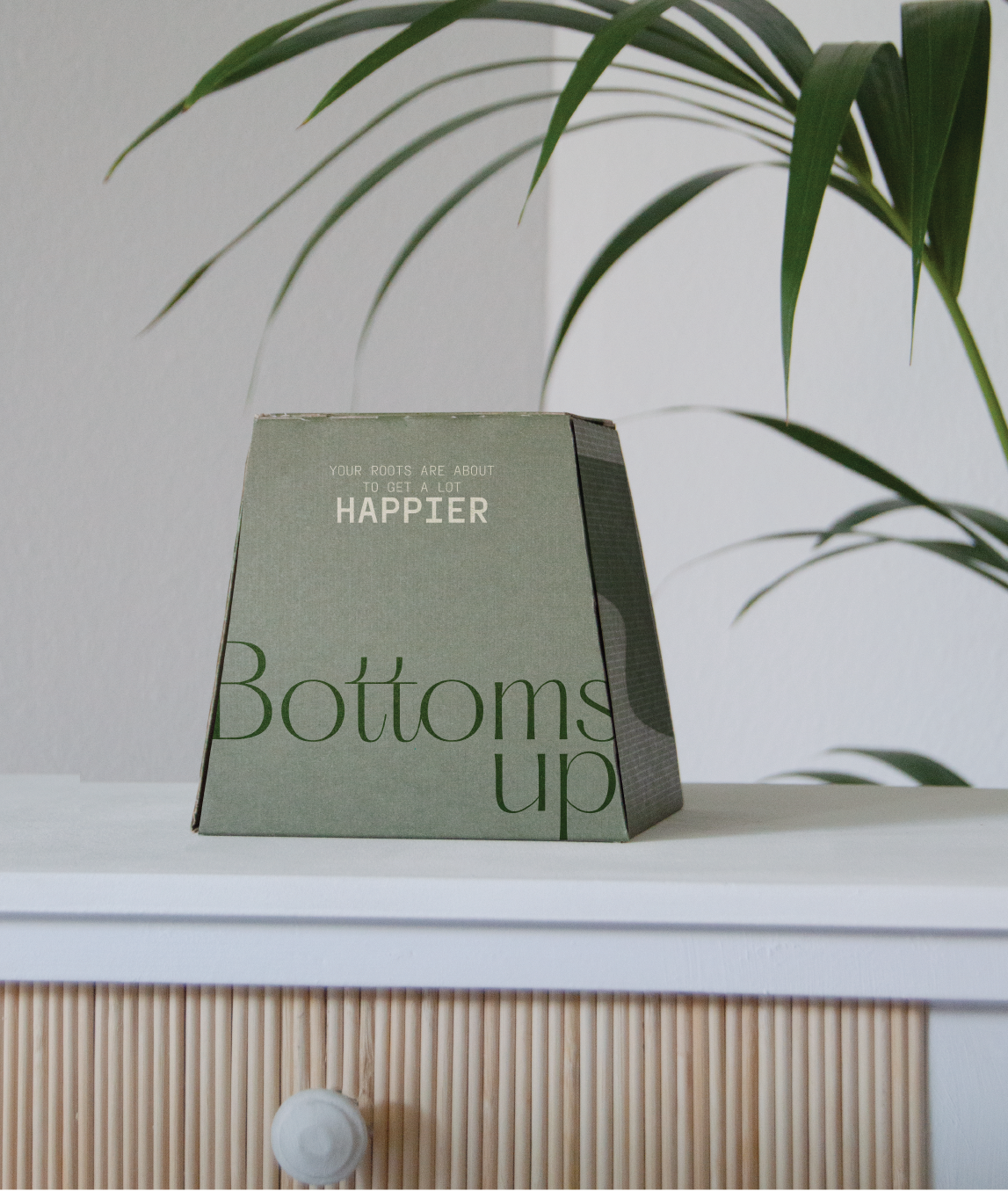
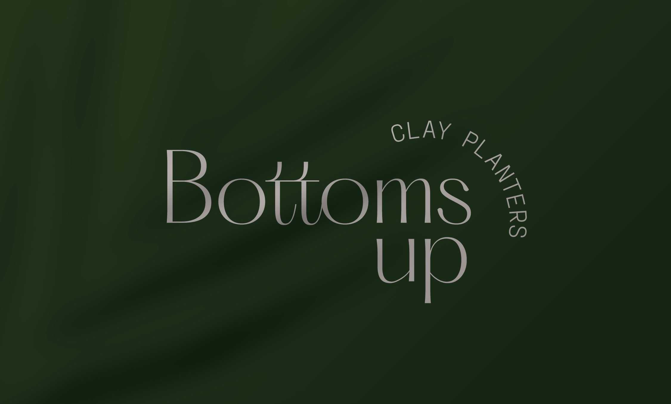
bottoms up
naming, branding & product design
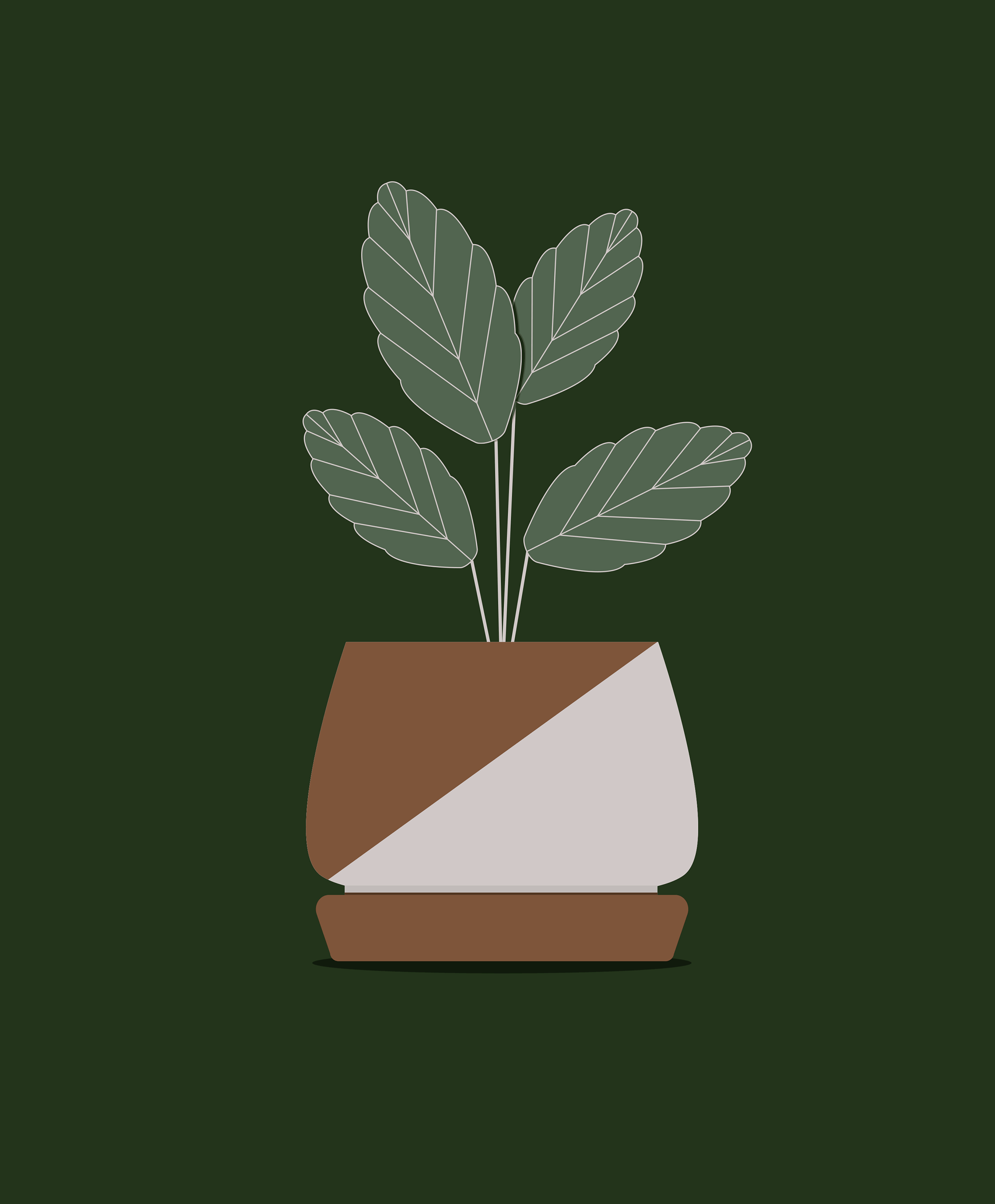
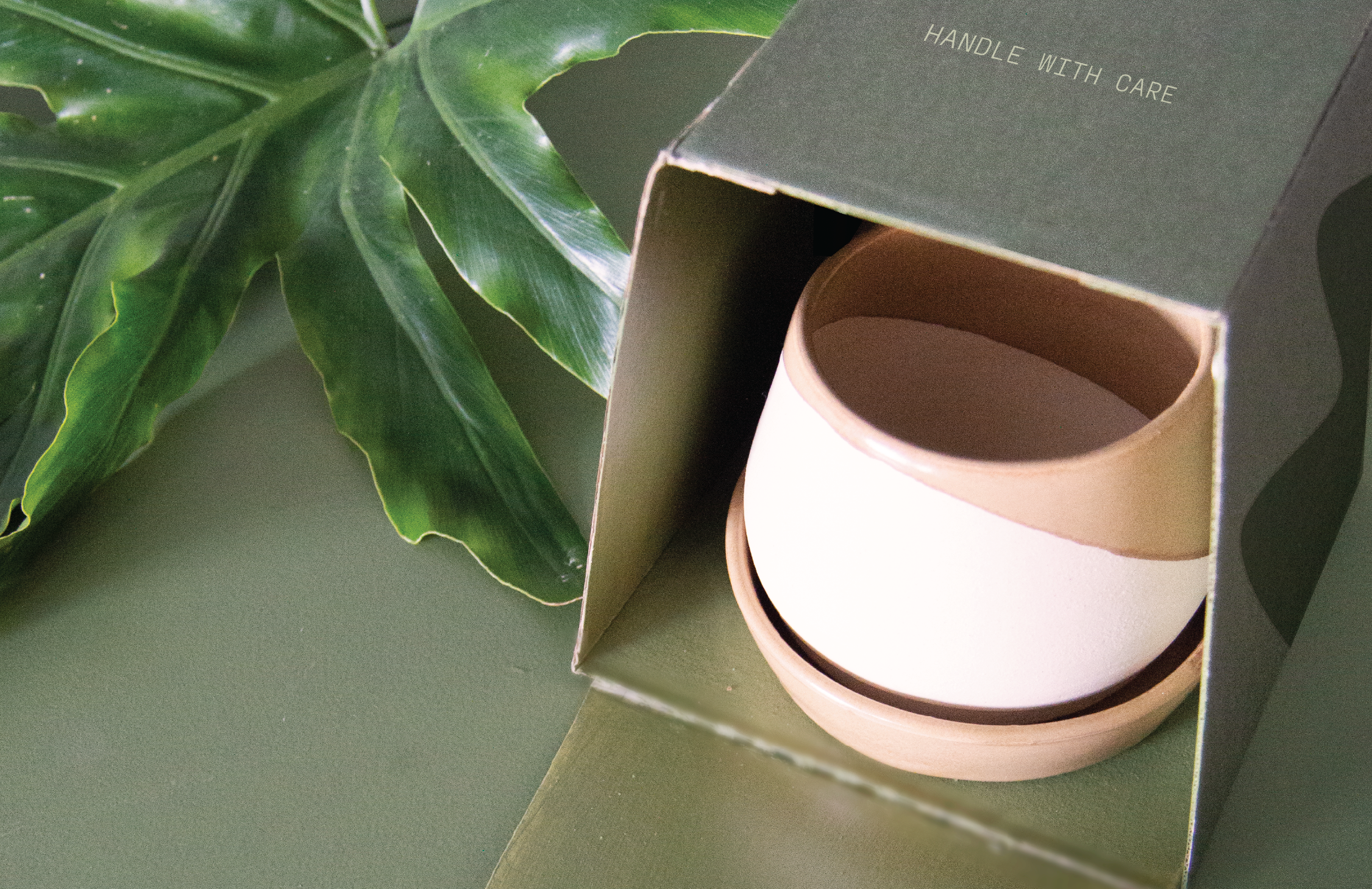
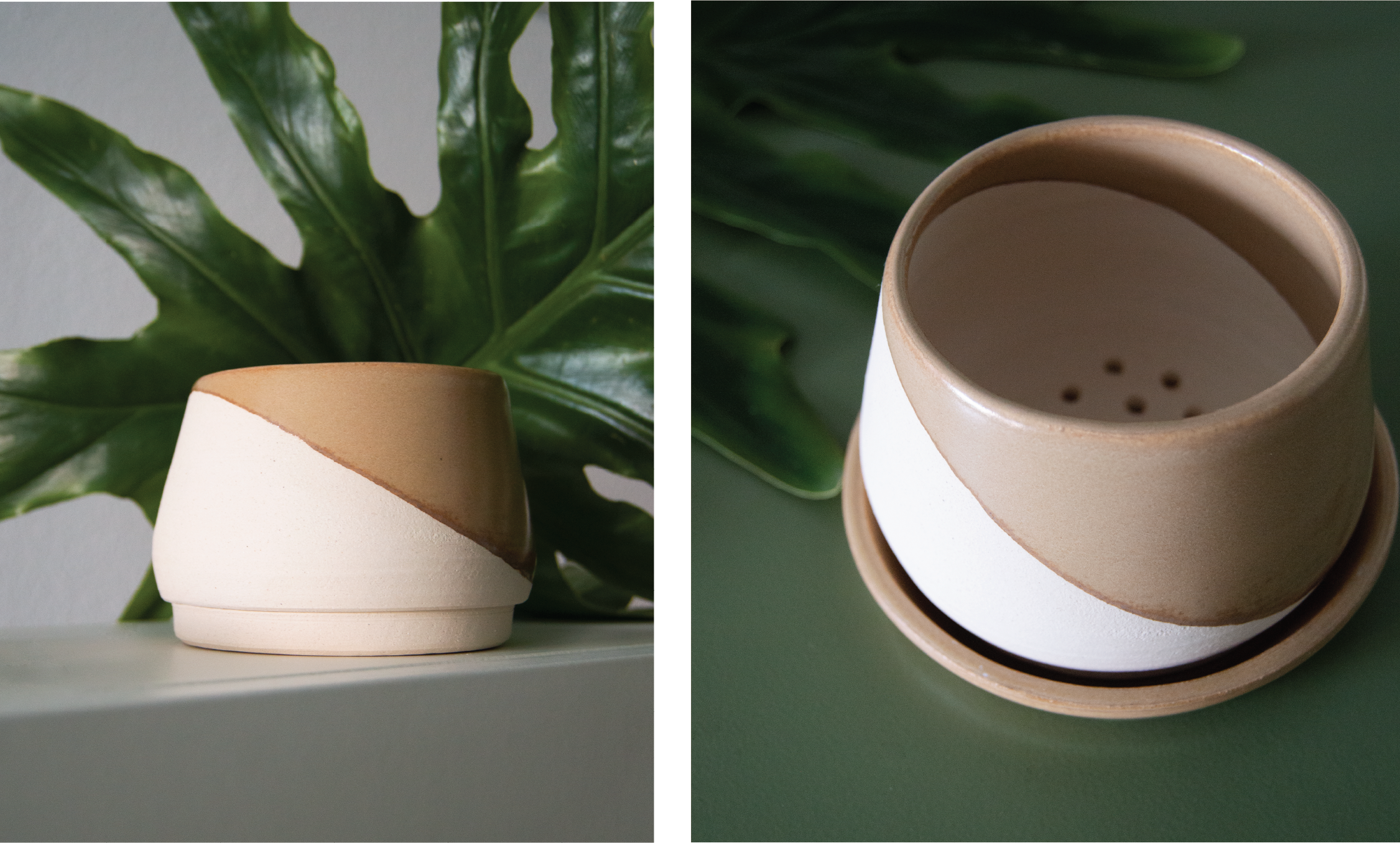
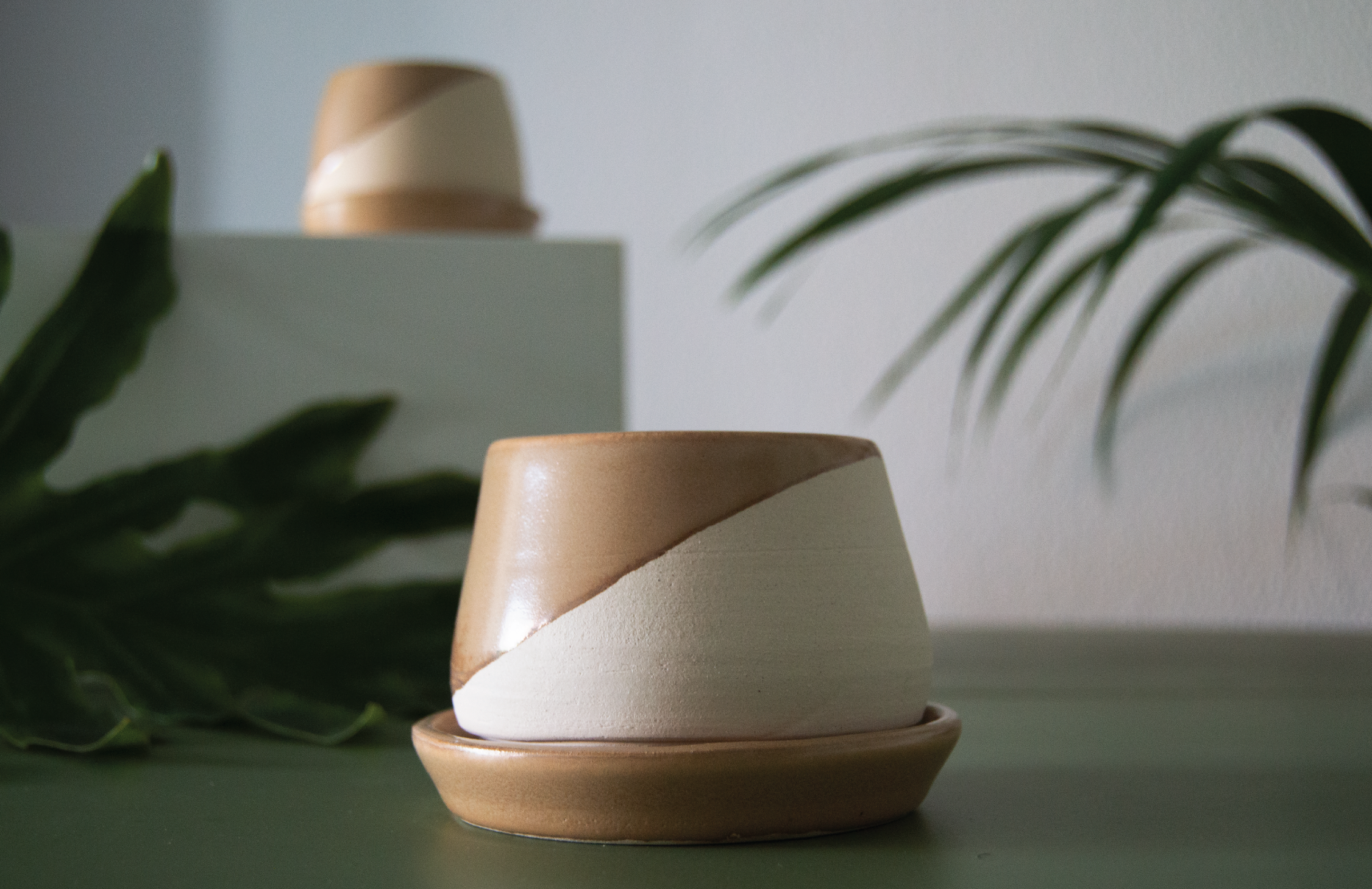
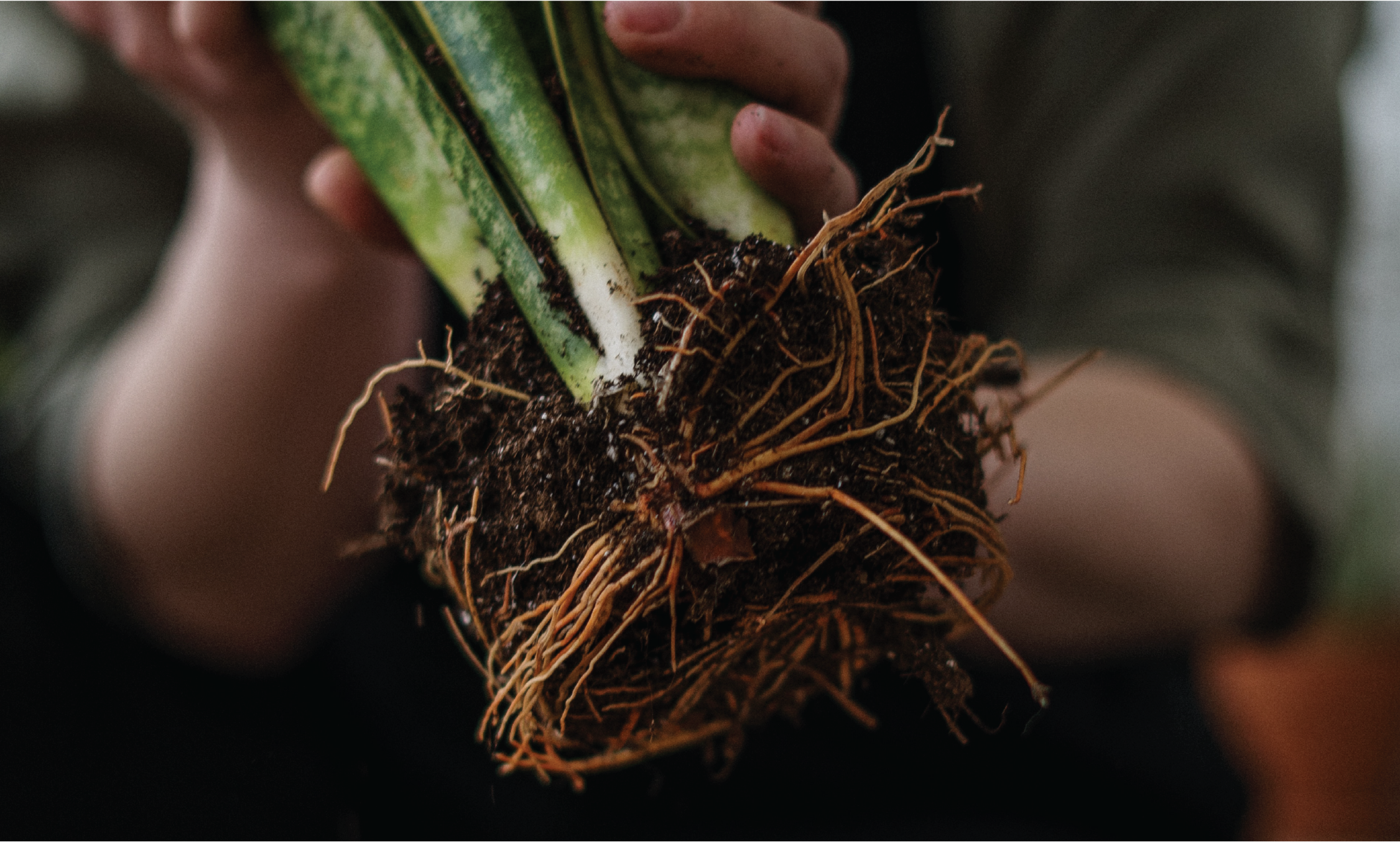
Sub-irrigating clay planters.
for those of us that have an indoor forest it can sometimes be overwhelming when watering day comes around, we love our plant friends but it can be difficult to keep them all hydrated and fresh, that’s why we designed these sub-irrigating planters, that let them drink from a reservoir on a needed basis, keeping them and you happy.
Objetives
Create a cohesive brand experience. Design collateral for digital. Position the brand as expert/artisan.
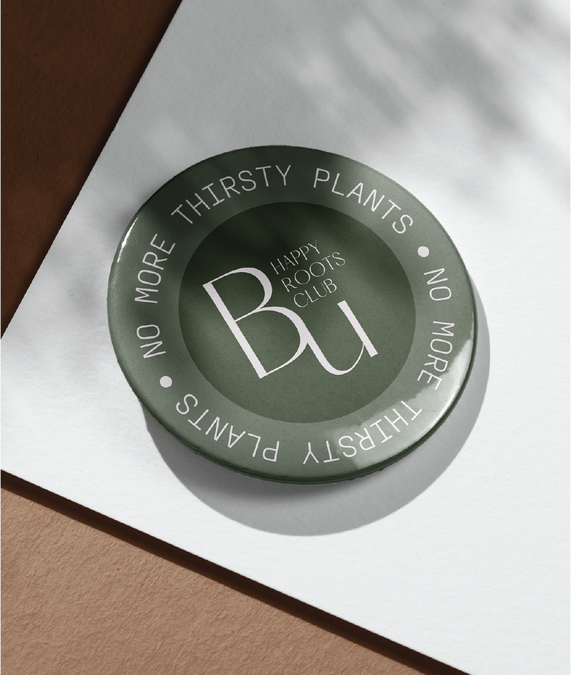
naming
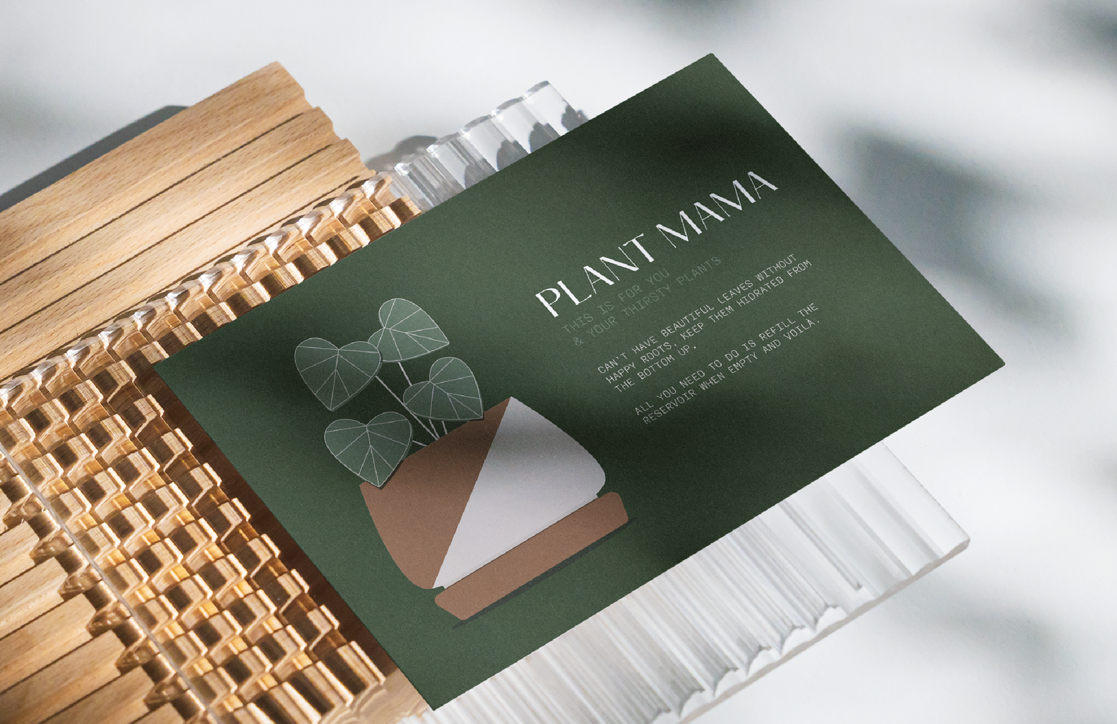
the main product benefit is it encourages the development of healthy and natural rooting systems, as it places the potting mix in direct contact with water and it irrigates the rest through capillary action as it does in nature. Basically providing consistent moisture from the bottom up. this is why for the product name we merged the informal definition of “bottoms up” a friendly encouragement to finish your drink, and the complex irrigation system naturally plants have.
concept
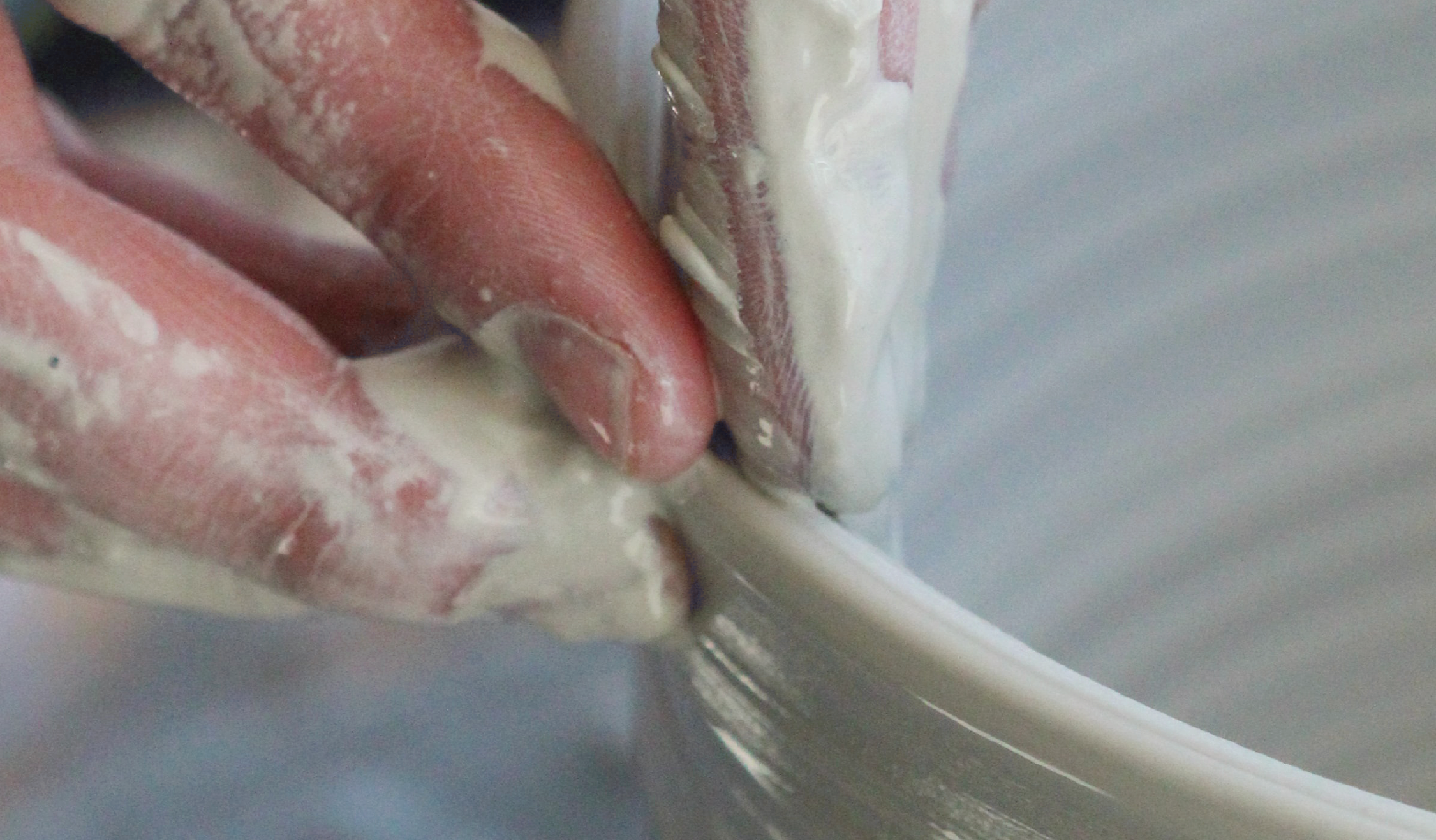
hand-spun clay has some sort of magic in it, it stands far away from factory-produced embracing imperfection and uniqueness, for us it was pure inspiration and wanted to portray that same feeling, so we chose a sans serif font that had a hand rendered nature to it, developed as an homage to the Hatton garden it portrayed perfectly the fusion between man and nature.