Elizabeth
experimental packaging
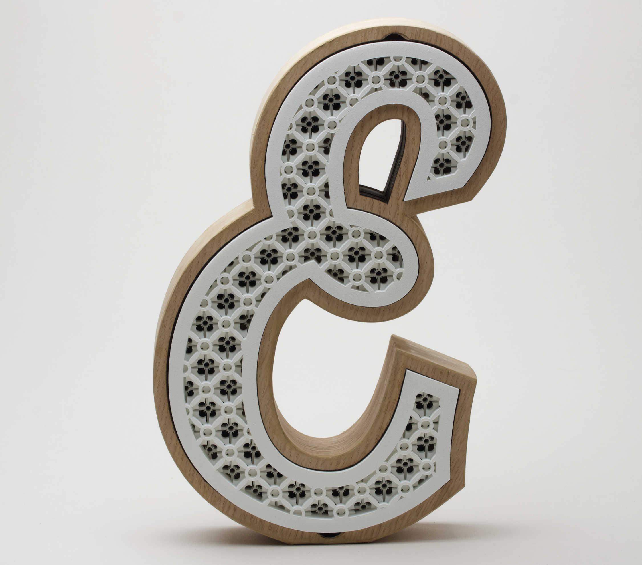
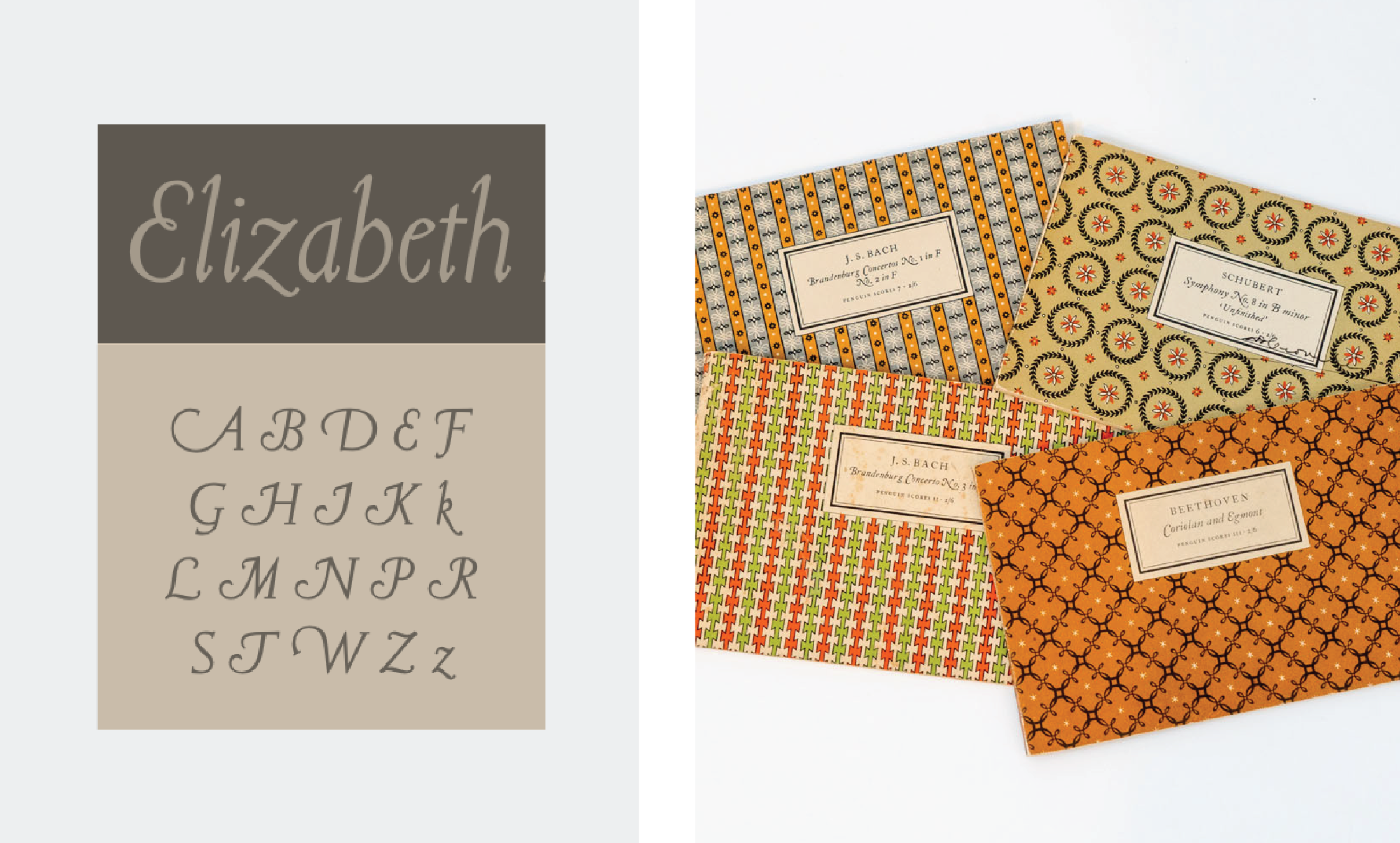
E for Elizabeth Friedländer
A student project inspired by one of the first women to design a typeface, today we remember her work for the series of patterns she made for the covers of Curwen and Penguin Books.
Objectives:
Create a packaging for a letter from a particular typography. Render tribute to the designers work. Experiment with materials and techniques.
Project developed at BAU with LoSiento studio.
process
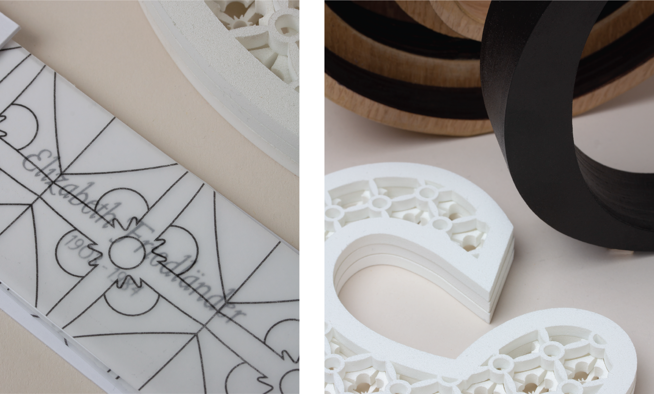
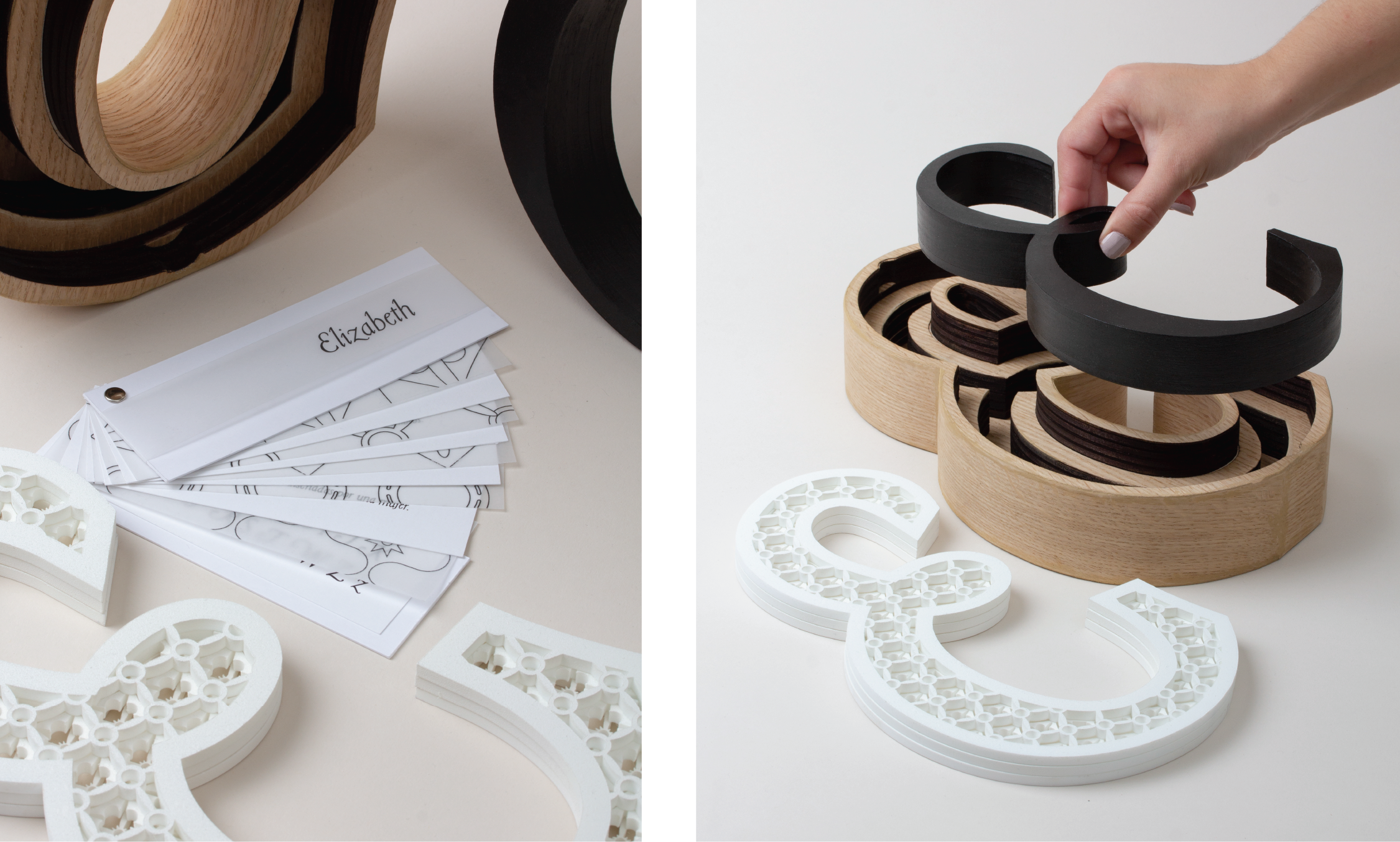
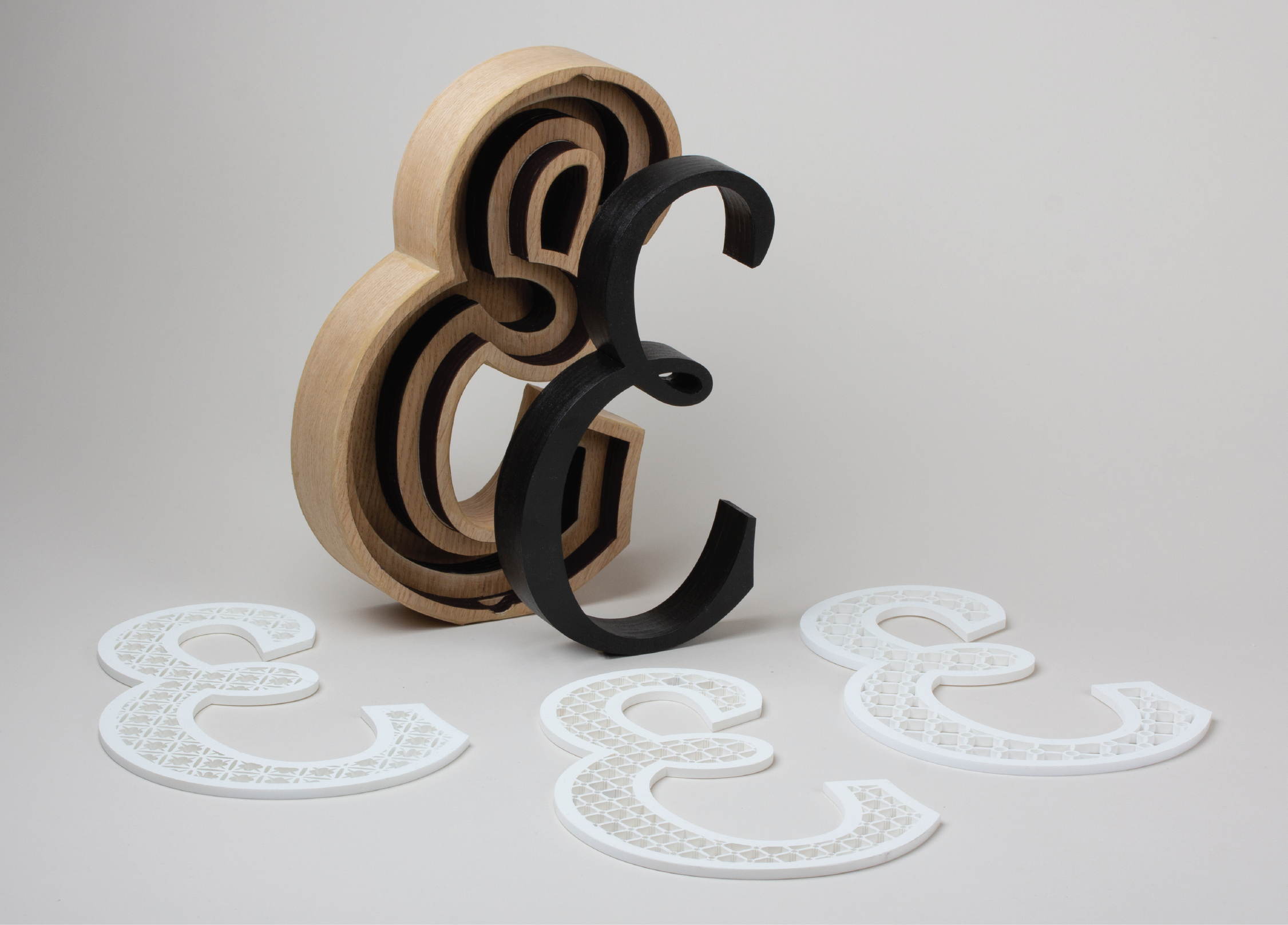
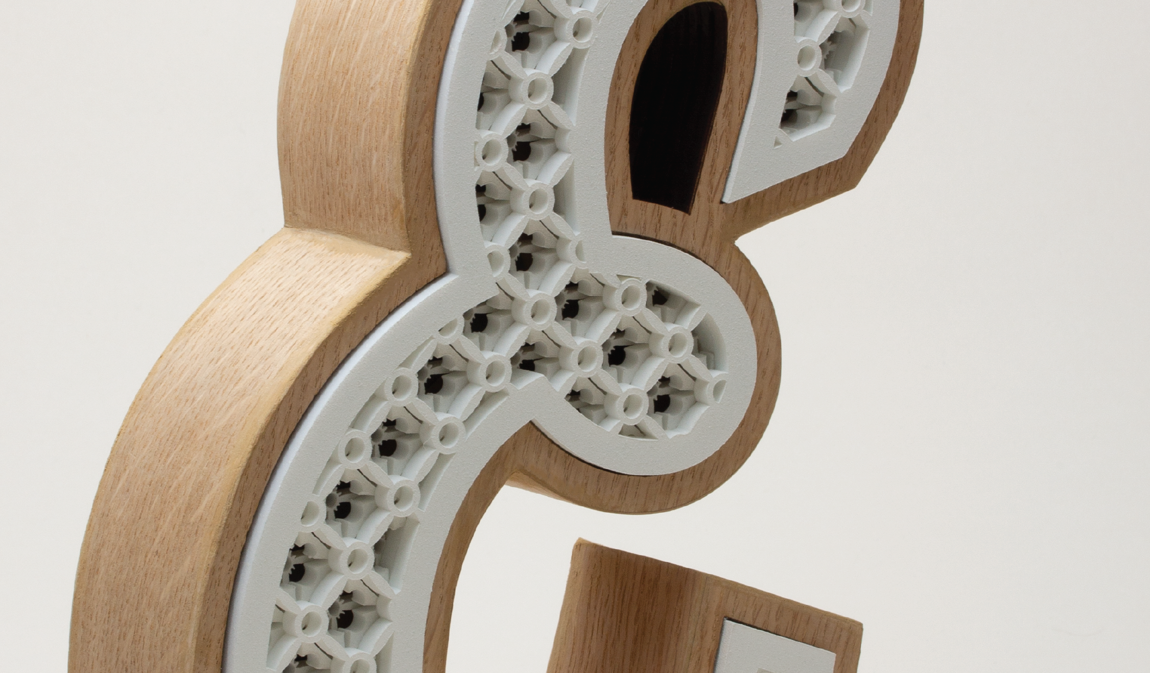
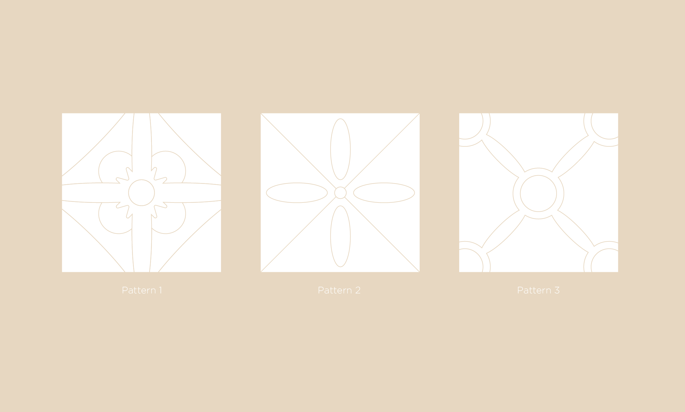
I chose the “E” as it was the author’s initial and the character’s curved shapes generated interesting design possibilities, after examining her work I chose a pattern that could be broken into three separate patterns and could be overlapped to create different depths.
materials
the shell is made of MDF boards laser cut and hand covered with natural wood laminate, and the lid is formed by three separate pieces of laser cut white acrylic sheets designed to be interchangeable.